
Making Excel Charts, Formulas, and Tables with Python—PyderPuffGirls Episode 8
In this last post of the series, I will continue on automating Excel with Python and show you how to use a few commands outside the Home Tab.
In this post, I will show you how to
- Insert image
- Make charts
- Write formula
- Make tables
and conclude the series with a productivity tip in data science.
Installation
Like the previous post, I will use openpyxl to make the Excel spreadsheet. But there is one more library to install if you want to follow this guide: PIL (Python Image Library). Otherwise, you will see this error:
When I googled it, latest version of PIL was for Python 1.5.2—wtf? So, do not pip install PIL. What I need to install was the Pillow library:
pip install --user Pillow
Inserting image
To insert an image from disk, I can make an Image object, then add the image to worksheet by anchoring the image on its top left cell.
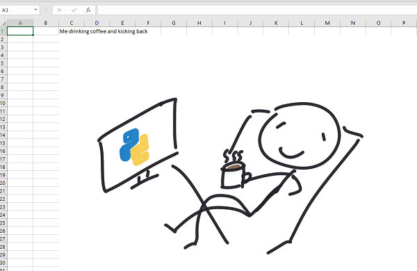
For example, in this piece of code, I put an image on cell C2:
from openpyxl import Workbook
from openpyxl.drawing.image import Image

workbook = Workbook()

coffee_image = Image('coffee.png')
worksheet.add_image(coffee_image, 'C2')

worksheet['C1'] = 'Me drinking coffee and kicking back'

workbook.save('example.xlsx')
workbook.close()
and the result looks like
Scaling image
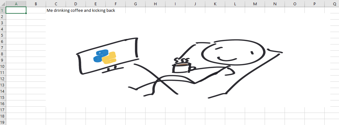
I can also modify the Image before I insert to scale my image. In particular, I want to make changes to two attributes:
- height
- width
For example, I can the height to 50% of the original image in my code:
coffee_image = Image('coffee.png')
coffee_image.height = coffee_image.height * 0.5
worksheet.add_image(coffee_image, 'C2')
As a result, the spreadsheet looks like
Charts
openpyxl only supports a limited number of charts. To see the full list of supported charts, please refer to the documentation
Making charts
Charts in Excel are a way to display referenced data. So my goal here is to set a range of cells (say, a rectangular grid of cells) that I want to plot with.
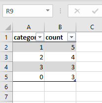
Let’s say I have some data called cp_count (count of first 15 rows of the UCI heart disease data.)
from openpyxl.utils.dataframe import dataframe_to_rows
from openpyxl.chart import BarChart, Series, Reference

cp_count = pd.DataFrame({
    'category': {0: 1, 1: 2, 2: 3, 3: 0},
    'count': {0: 5, 1: 4, 2: 3, 3: 3}
})

workbook2 = Workbook()
worksheet = workbook2.active

for r in dataframe_to_rows(cp_count, index=False, header=True):
    worksheet.append(r)
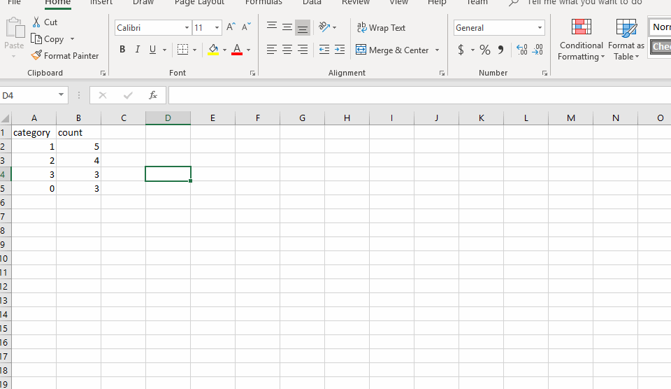
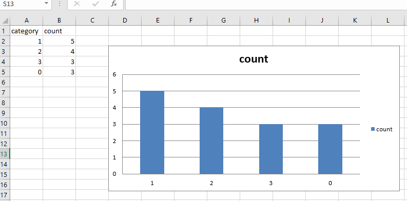
Once I wrote the data to the worksheet, I can make a chart at cell D3 by setting the reference of my bar chart to the corresponding data cells:
sheet = worksheet.title

chart = BarChart()

# range_string use the format
# sheetname!top-left:bottom-right to select data
data = Reference(worksheet, range_string=f'{sheet}!B1:B5')
category = Reference(worksheet, range_string=f'{sheet}!A2:A5')

chart.add_data(data, titles_from_data=True)
chart.set_categories(category)
worksheet.add_chart(chart, 'D3')

workbook2.save('chart_example.xlsx')
to get
I used range_string here to select a rectangular box for my data. There is another way to select the range of data by defining a box with the column and row numbers:
data = Reference(ws, min_col=2, min_row=1, max_row=5, max_col=2)
category = Reference(ws, min_col=1, min_row=2, max_row=5)
Omitting one of the max or min means we are selecting on only one column or a row. The resulted chart is the same.
Chart attributes
Based on the documentation, there seems to be a few attributes I can tune for my charts
Style
If I add this line,
chart.style = 10
then it creates a slightly different chart with white boundaries around the bars. I have yet found any documentation on which number maps to what style in Excel—so if you figured it out, let me know.
Unknown attributes
There are a few attributes in openpyxl’s chart page that I found wasn’t doing anything visible. i.e.
chart.type = 'col'
chart.shape = 10
Writing Formula
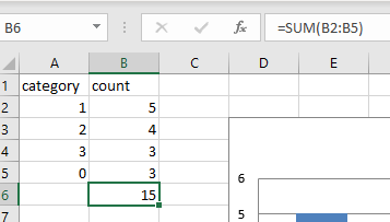
I can write an Excel formula by setting a cell to the correct formula name and data range. For example, to calculate the sum of column B, I can call the SUM function in Excel by writing
worksheet['B6'] = '=SUM(B2:B5)'
which gives me
Format as table
A table in Excel, like charts, is a reference to a group of cells. In openpyxl, there is a Table object that I can style by the same table style name from Excel.
For example, if I want to use Table Style Light 1 from Excel on the same data that I used for BarChart, I can first find the name from Excel
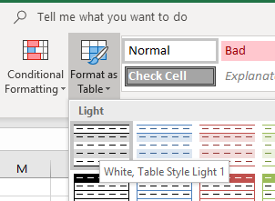
then I can write
# data, workbook, and worksheet are the same as in the BarChart example
tab = Table(displayName="Table1", ref="A1:B5")

# I list out the 4 show-xyz options here for reference
style = TableStyleInfo(
    name="TableStyleLight1",
    showFirstColumn=False,
    showLastColumn=False,
    showRowStripes=True,
    showColumnStripes=False
)
tab.tableStyleInfo = style
worksheet.add_table(tab)

workbook2.save('table_example.xlsx')
and it gives me
For documentation, see
The End
Thank you for reading through all 8 posts of PyderPuffGirls! (And thanks Keith, for coming up with a name for our sessions!)
This series of posts came from my observation that many people in analytics tried Python but did not see how it can help them in their job. I hope that through these posts, you have found at 2-3 things that you can use to automate away the boring parts of an analytics job—that can be reinvested to more challenge and rewarding work.
Therefore, I want to close this post with a final trick:
The final trick
Even if you have made yourself more efficient through automation:
Gently exceed your user’s expectations
because is tempting to give the users what they want once it is ready.
If I can get a report in 5 minutes, then I can email them the result on minute 6, right? But this is a terrible pattern—new tasks and requests arrive the moment you send the old one out.
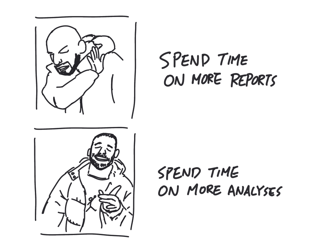
Instead of giving the users what they want, give them what they need. Send the reports out on the same schedule to buy you extra time. Use the extra time on problems that only the human mind can solve to discover and develop data insights. I think this is where the real fun in data science is. So let’s put an end to the boring stuff and have fun.
More PyderPuffGirls
If you have read through all 8 posts of PyderPuffGirls, PLEASE LEAVE A COMMENT BELOW.
What did you learn from it? What did I miss? What else can I cover? Let me know!